Nail art March 4 – Ombre
Jeg er lidt bagud med at poste til Nail art march udfordringen, men det går nok.
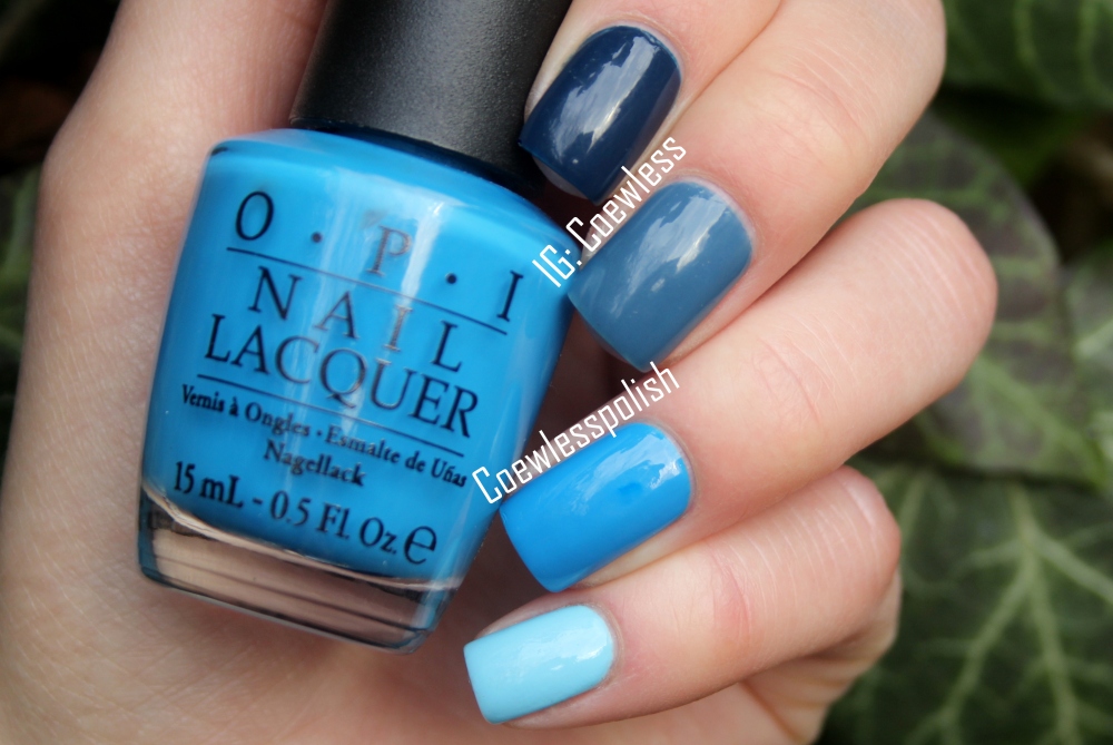
Dag 4 var Ombre (og jeg havde åbenbart opfattet det som gradient, fordi det var det folk på instagram havde lavet. Så jeg havde allerede de fineste farver klar til en gradient, men måtte så finde på noget andet, da gradient og Ombre bestemt ikke er det samme for mig). Jeg valgte at lave en blå ombre. Blå er tilfældigvis min yndlingsfarve når det kommer til neglelak (og faktisk også bare sådan generalt. Elsker navyblå!), og dette er sådan set nogle af mine yndings blå lakker.
Jeg har kun valgt cremelakker til denne mani, da jeg nu engang synes, at ombre manicurer er finest når alle negle har samme finish.
Her er det fra øverst til nederst; Chanel Magic, Chanel Blue Boy, OPI Ogre the top blue og OPI What’s with the cattitude
Jeg er egentlig ikke tilfreds med denne mani. Synes ikke farverne går godt sammen, men det var de blå jeg har, som fungerede best sammen. (Og billedet er crap.)
________________________________
I am a bit behind with posting pictures for the Nail art March challenge. But that’s okay.
Day 4 was ombre (and I thought it was gradient, cause thats was what people were doing on instagram. So I had already found some great colors for a gradient, but had to find something else, cause in my mind gradient and ombre is not the same) I chose to do a blue gradient. Blue happens to be my favorite nail poish color (and is my favorite color in general. I love navy blue!) and this is actually some of my favorite blue polishes.
I chose to do it with only creme polishes, cause I do like ombres best, when the nails have the same finish.
Here it is, from top to bottom; Chanel Magic, Chanel Blue Boy, OPI Ogre the top blue and OPI What’s with the cattitude
I’m not really that satisfied with this mani. I don’t really think the colors go that well together, but they are the ones I have that worked best. (The picture is crap.)
 Coewless nail polish blog
I do agree, for me ombre and gradient aren’t the same aswell. You could try mixing your chosen colour with white. I’ve done it once and the ombre worked great.
I agree ombre and gradient are different things. I like the blue you’ve chosen although as has been suggested – maybe some mixing would have made for a more traditional ombre of tones. Really pretty though – jealous of your OPI Shreks.